Sunday, September 15, 2013

Le Suckfest

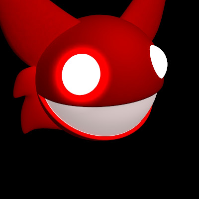
Recently deadmau5 dropped a single entitled "Suckfest9001" - As usual, this Soundcloud release lacks an album cover; therefore I obviously had to make one to avoid the boring default background of a barely-opaque music note appearing when listening to the song.

I used the backdrop from my really, really old bike tutorial file for this setup:


By pressing 7 on the keyboard, I'm able to see what my spotlight looks like while I'm working on the project without having to render it. I wish I would have realized this earlier into the creation of this file, as I couldn't figure out why only one spotlight worked whenever I had multiple shining onto the mau5head.


Unfortunately, I had to boolean into the head to dig out the eye socket shape. I did my best to not make it look horrible when smoothed. I ended up trying to improve the final render by digitally painting around the eye in photoshop.


What the head looks like from above


I enjoy messing around with the render settings, so I used both Raytrace shadows and Depth Map shadows and compared them.

Depth Map shadows appeared more realistic and showed up in the reflections of the mau5head:


Raytrace shadows definitely had a beautiful, simplified look to them and made the mau5head appear more shiny, but I didn't like how they didn't appear in the reflection. I probably could have fixed this in settings, but I still preferred the Depth map shadows' realistic look.


This is the final product: 


Prototypes

Later, over on the deadmau5 subreddit, someone complained that I used a font other than Arial Black for the title. I would love to explain to them that I chose a weaker-looking, breakable font that matched the mood of what is supposed to be a SUCK fest rather than a strong, stable font such as AB, but this is what my first prototype looked like (which happened to use AB anyways):


Here are other fonts I tried before settling on the final


Tuesday, April 23, 2013

The Mauz is Finished

Created the tail - wanted it to look like the new Nick TMNT style - a bit blocky and geometric - With little indents


Yes.. I know it kinda just looks like a worm..

With that, I am finished -


CREEEEEEEP


 This is the angle it is meant to be viewed in regularly:


Well that's that


Thursday, April 18, 2013

Mauz can count to 2 now!

Today my crea-tor has bestoweth upon me my arms and hands!

Now I am able to wave them around and grab things, like pie!

Last time I added tread to his shoes: (this resulted in messed up geometry but y'know what?! I DON'T CARE!!!)


Annnnyways... First I fixed the shirt problem by creating a tongue to cover it. Oh, so shiny Phong E...


Then I painstakingly recreated his arm from a cylinder - Now he can proceed counting to two - His favorite hobby

I dig his toothy skeleton, yo


Next I needed to re-create that NURB in polygon form for his left arm

 So I did..arm from cylinder, hand from cube


Here's what he looks like naow- Almost finished! Just needs a tail


This is the current high-quality render: OOOOOohhhh... He's so pretty...


Saturday, March 2, 2013

Evil Mouse Shoes...

Built the arms from NURBS curves extruded from circles and built a hand from a cube - No idea how I'm going to attach them yet but I'll worry about it later - Also built the shirt/shorts out of cubes - Now the body goes through the head into the mouth and I can't really fix it without the inside of the mouth looking lumpy


Worry about that later too, I guess..


As of right now, it just looks like he's trying to do some sort of ballet pose...


And, naturally, counting to two.


Will build the other hand later


The shoes were very, VERY problematic - They were easy enough to form out of a cube, and the shoelaces out of CV curves/Nurbs circle extrusion...


But all heck broke loose when I tried to add tread to the bottom of them.  Not only was the tread not working out because my vertexes starting going wacky when smoothed, but I accidentally selected a vertex that was on near the ankle and started twisting it around without knowing it.

When I finally finished the tread, there was a gigantic weird hole with many faces near the back of the shoe - I didn't have enough undos to fix this

So I quit, opened a new file, and copied and pasted an old shoe over - But then it wouldn't texture right - Weird blotches started popping up and they even showed up during the render


Without lighting they looked even worse-


So, instead of building a new shoe, I just deleted all of the weird faces and sewed the shoe back together - I tried this before I tried the copy-pasting but thought it was hopeless so quit.  Then I realized how super hopeless the copy-pasted file was and accepted the fact that my topology wouldn't be the best, but that it's okay.

...Aaaaand now my file won't open at all...
WONDERFUL!!!

Friday, March 1, 2013

Make-a-Mauz!


This is Mauz.  He likes smiling and counting to two.
There may be confusion about the gender if you look at his(?).. chest anatomy here.
I designed it as a girl then later decided it would be a male.  AAAAnyways...

...I thought I'd try to model him.
I started with the head. Then went ears. Then eyes. Then mouth. Then hat.  The hat was (dare I say it??!) fun to UV (because it was easy) and texture.


I also discovered (through Youtubing) how to render with a white background!!!
You must turn on final gathering in the render settings and change the background color of the camera under "Environment" in the Attribute Editor.

Current head render:


The teeth were hard to align no matter how much I changed their pivot points and froze their transformations...

Here is his face without the skin (fur?) - I added this so his insides wouldn't appear yellow when seeing through his massive molars


The ears, hat, and nose were made of cubes - The eyes and the inside and outside head are spheres, and the teeth were cones (because pyramids weren't working!!)  The whiskers were CV curves extruded from a NURBS circle - I may attempt to re-make the head out of a cube. MAYbe.


It will eat all of your children


I am deciding whether to leave his eyes as blank-white surface shaders or add minimal shadow (above) - Also trying to make the gums shiny but not reflective - Will save nit-picking for later, I suppose.

On to the body!

Thursday, May 3, 2012

Summer Project - deadf0x

Because I enjoy deamau5 music, but just a couple of his many songs are... let's just say, "OC inappropriate," I decided to blatantly copy parody some of his album covers using a fox instead of his mouse...this way it's kind of like saying I don't approve of everything about him; just enough to mess up his covers or something (I don't completely understand what I just typed either)

The first album cover, Random Album Title, looks like this:

Here is what I did in Maya- (the first image is an in-progress shot; the second one is the final render)
 
This is somewhere in the middle of my work, I wanted to change the camera angle and make the eyes more pop-out-ish - Also, I know the mouth is wrong but I could not figure out how to make the smile NOT stretch all the across the circle (I think the artist used a different program than me)


Here's the final render, completely done in Maya-


Here is the album cover finished in Photoshop - All I did in Photoshop was add text, darken the image a little bit, and add a little more pinkish highlight to its right eye- I wish I could have found the exact font for the subtitle, but I did the best I could (according to the original album cover the letters were supposed to be more spaced apart but I was also supposed to keep the subtitle the same horizontal length as the title)


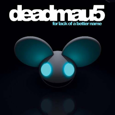
After that I wanted to do his next album, for lack of a better name-
 

I was able to use the same model as the first cover I recreated, all I had to do was stretch out the eyes a little and move them closer together then change the material colors - The lights took a while to get right though- and it took me a minute to remember how to get shadows in there

Here is the light setup I ended up using - I was glad to use the knowledge I gained about Spotlights and Light-linking from Digital Tutors

 3 ambient lights, 3 spotlights, and 1 directional light - I made it so two of the ambient lights ONLY affected their corresponding ears, and the two spotlights shining on its eyes only affect the head-sphere

 The reflection, however, I could not do well in Maya; here are two tries-


This one I was simply trying to get a reflective surface - I used a Blinn and turned it black and upped the reflectivity settings 

This one was closer to the album cover but not yet what I wanted - I gave up after a while and decided just to add the reflection in Photoshop =P

 Here's the final image - The only things I did in Photoshop were the text and the reflection (I simply duplicated the head, flipped it upside down and lowered its opacity)


These two covers took 1 day each to make (and when I say one day I mean sitting on my bed for at least 5-8 hours each) - I learned that even though the modeling was quite easy, the lighting took 95% of the time to fix - I am glad I learned about Lighting and how to use the Render View from Digital Tutors!

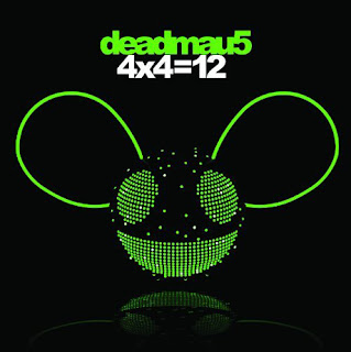
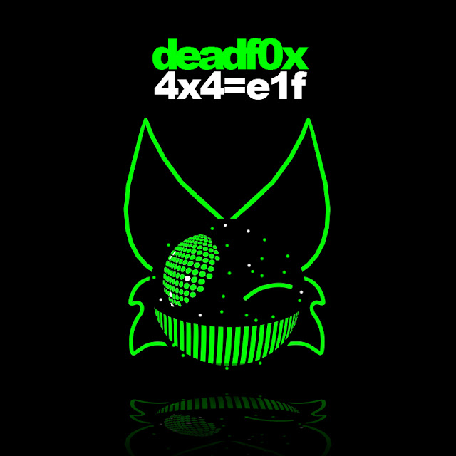
The next cover was difficult - I gave up trying to get the eyes and mouth right - Now I am curious as to what program the designers used to make 4x4=12

I ended up accidentally creating a cool texture for the teeth by tweaking a "bulge" texture- Also, I felt too lazy to try to get the other eye right that I made him wink instead - This model consists of a sphere and NURBS curves I converted into polygons then smoothed - This is the first model so far that I spent more time in Photoshop making than Maya because I spent a day trying to get one eye right trying various ways

All I needed was an ambient light for my lambert because the green surface shaders appeared in the render whether there was a light or not

Final render used:


Final Photoshopped image - (text and spots added)
(eh, elf almost rhymes with twelve)


And because I saw some of his single song-art different colors, I imitated it in Photoshop


And this has nothing to do with Maya, but I did do another cover just in Photoshop - It fits in with the subject of this post

Reference album - Meowingtons Hax tour trax-

 My rip off version that proves I still have a lot to learn about foreshortening
So, yeah...this project gave me experience in both Photoshop and Maya - Most of it having to do with lighting rather than modeling, which I didn't mind - Trying to imitate the lighting was challenging but fun